Windows Phone failed, but its design stood the test of time
In 2012, the smartphone market was exploding with some insane competition. Mobile operating systems were desperately trying to catch up to Apple and the iPhone. During this time, platforms like WebOS and Blackberry were still in the game. But they were on their way out, as they struggled to create an ecosystem of apps as Android and iOS had done. However, not everyone had given up to Google and Apple just yet, as Microsoft pushed its new Windows Phone platform on a large assortment of new smartphones.

Windows Phone shared more similarities with iOS and Android than BlackBerry did, in the sense that it focused more on the on-screen keyboard and a better app marketplace. Microsoft also benefited from having many different hardware manufacturers creating high-end devices that ran the Windows Phone OS. The vast variety of phone options, with top-of-the-line specs, put Windows Phone right up there with Android and iPhone, even if only for a very brief period.
Unfortunately, Windows Phone never sold very well. I never came across anyone else that owned one as I did. I always liked showing off my HTC 8X to other people and seeing them be impressed by something that was completely different from what everyone else had.
But after using the phone for more than a few minutes, people begin to notice that many of the most popular apps from the time were missing. Many popular apps like Instagram, and even YouTube were completely missing from the Windows Phone store. Without apps to support the most popular social media platforms at the time, Windows Phone was a hard sell.

In 2015, Windows Phone was changed to Windows 10 Mobile [a continuation of Windows Phone], which didn’t perform any better in sales. In 2017, Windows Phone was officially killed, leaving Android and iOS without a third competitor.
Windows Phone had a Superior UI
Many people recall Windows Phone as being an objectively better OS than WebOS and Blackberry, but just not quite as good as Android or iOS… Right? The way I remember it, despite the lack of apps, Windows Phone performed far better than any other OS at the time and had a vastly superior UI. As nostalgia has a tendency to distort a person’s memory, I ordered my old HTC 8X from eBay (you can get one off Amazon), to see if the UI really was as good as I remembered it.

When opening the still freshly sealed phone from eBay, I instantly remembered how much I enjoyed the design of this phone. It has a soft plastic back which has an almost-rubbery feel to it. The Windows Phone navigation buttons are placed on the chin, featuring the familiar Window Start icon.
Stock Android 4.1
In 2012, the Android Jellybean 4.1 update was just hitting phones. This was a pretty significant update for Android, introducing many new features. The tech community was all over this new update as it pushed the mobile operating system into new capabilities.


But wow was it ugly. The screenshots you see here are of stock Android. The icons have no consistency, the menus and navigation were awful, the text was horrible, and just about everything here is a UI nightmare. The Holo theme may have been an improvement from what we had on Gingerbread, but Android still had a long way to go, as Google very recently demonstrated with Material You and Android 12.
Those were still the early days of Android. The system still suffered from terrible performance at times. App crashes were a regular occurrence, along with long load times for games. At the time, this was understandable, but looking back – this could have been done much better.
Samsung Touchwiz
In an attempt to make Android more palatable, OEMs put their own interface over the software. This is Samsung’s Touchwiz UI which you could find on phones like the Galaxy SII.
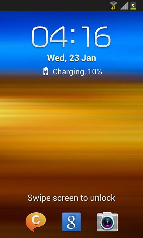

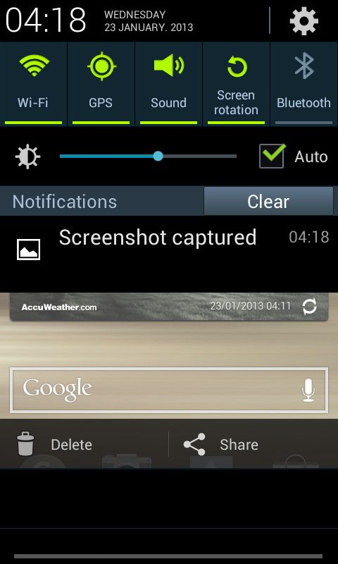
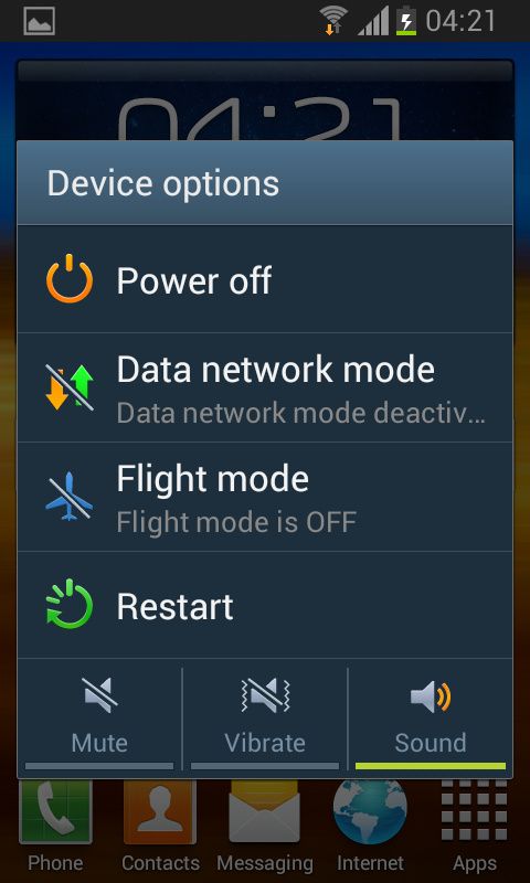
Even with this attempt to make a more uniform look to the system, it has aged so poorly. The widgets are horrendous, the icons too puffy with big drop shadows, and the text is inconsistent throughout.
To top everything off, the added Touchwiz UI only worsened Android’s performance issues and exacerbated the fragmentation problem. This sparked the massive push for custom ROMs, as people wanted to get better performance and less bloat in their phones.
Apple iOS
Apple was considered to be the peak of design at the time. They were the system that every other company wanted to copy as closely as possible. Looking back, I find it hard to believe that this was ever considered to be good.
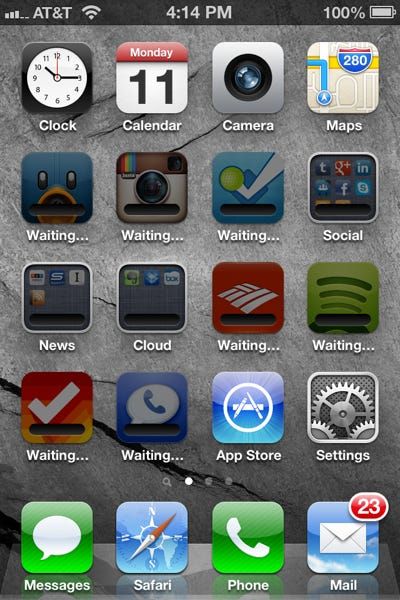


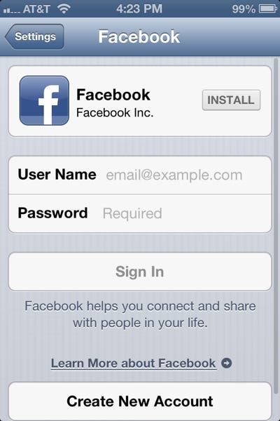
It’s difficult to even know where to begin with this. The iOS design from 2011 has the same energy as waiting in line at the DMV, in a building with broken air conditioning. To me, this is perhaps the ugliest UI design in smartphone history.
Windows Phone
Then there was Windows Phone. The platform that the fanboys mocked and ridiculed into extinction. But when you take another look, you’ll notice that this UI hasn’t aged at all. In fact, it looks more like a UX that could be used in 2021.


Notice the flat UI, with the tile-based system. The text, images, and menus are consistent throughout the phone. The placement of everything is natural and makes sense. The default theme is dark, which Android and iOS users wouldn’t catch onto until many years later. Windows phone was far ahead of its time in many similar aspects.

Besides the UI that has aged beautifully, Windows Phone had amazing performance in its prime. Even as I use my HTC 8X in 2021, I don’t experience any lag or crashes that would suggest that this device is 10 years old. The animations are pretty smooth throughout the minimalistic design. The speed at which you can navigate from your home screen to your messages, to your maps, was significantly better than iOS and Android at the time.

While Android and iOS have adopted a few of Windows Phone’s features over the years, it still stands out as a completely unique UX.
Where Windows Phone got it Right
The biggest difference between Windows Phone and the other OS options is that Windows Phone was a completely new experience designed for mobile. Apple and Google created platforms that aimed to mimic the familiar experience you’d find on a desktop. Notice the home screen on your phone has a prominent icon, with a title directly beneath it. This is the same thing that you would find on your Windows 10 Desktop. However, Microsoft understood that the mobile device needed a new type of home screen. Now, this could be a controversial opinion, but I’d argue that the Windows Phone tiles system is better than the icons system that you’ll still find on Android and iOS today.
Now pull up your app drawer. Compare it to the simplicity of the one on Windows Phone. It’s a simple list of apps, in alphabetical order. The icons are uniform, with most of them being a two-toned color scheme. The text is white against black, with no drop shadows or 3D effects. The scroll animation behaves perfectly, as the icons scrunch and bounce back when you reach the end of the list. These types of animations would cause your Android phone at the time to explode. Now, imagine if we could experience the same with the sharp and smooth 120Hz displays that we use on phones today.
One of the most surprising things I noticed, as I used the HTC 8X again 10 years later, was just how many system apps contain nothing but text. Apps that are completely free of images and icons. It’s surprising how simple and effective this is.
I open my calendar app, to find a black screen with white text on it. Swipe from side to side to navigate your day, agenda, to-do list, etc. Navigate through all of these screens and you won’t find a single graphic. The app depends on simplicity and animations to make this such a fantastic app to use.
By doing so many things right, Microsoft made a system that actually stood the test of time, despite its eventual downfall. As someone who has used many smartphones since their introduction, I can confidently say that I enjoyed my Windows Phones far more than any Android or iPhone. In 2011, I truly believe that Windows Phone was a better system than the competition. If the system had caught on, and gained the user base needed to justify developing apps for it, we could have had much better smartphone options today. Instead, we live in a duopoly where complacency is masked as maturity.
The post Windows Phone failed, but its design stood the test of time appeared first on xda-developers.
from xda-developers https://ift.tt/3vdeBeL
via IFTTT
No comments: